


| File Listing: Dwarfletter Gothic | ||||||||||||||||||||
|
Last Updated: Jul 20, 2009, 09:16:01 am First Created: Jul 13, 2009, 09:51:46 am Author: LordZorinthrox
 Download Now Download Now |
||||||||||||||||||||
Description
An extensive revamp of the tileset. A scratch typeface designed specifically to complement the feel of Dwarf Fortress and to improve readability; thin letters are wider to fill the negative space and all tiles have some grit in the background to fill in all that negative space a bit. Uses the usual Mike Mayday technique of removing the diacritics from the language files and the Sean Mirren hack that makes all stone economic. But that is just for starters. Color scheme designed for lower eye-bleed factor and more flexibility. Careful use of all unused tiles and expansion of the set of tiles for stone, minerals, etc. to a total of 16 usable tiles. Lots of layer and mineral color changes that use the "overloading" technique to give the tile colors more interest and more realistic looks, as best as I can tell. The underground really looks interesting and colorful now. Metal colors that make sense; most use a main color of the metal and a background color of the corrosion/oxide of that metal as best as I can find. This applies to ore veins, too, so metals are far more identifiable now (copper has a patina, hematite has bright red oxide in it). Almost obsessive use of the "blackout silhouette" technique to give a large portion of tiles that extra pop, largely for all the small animal tiles. Fancy trick for trees that make them look like trees. Use of the plant and matgloss tokens sitting in the EXE that no one seems to use...this lets all plants have their own shrub tiles and colors, and Tower Caps have their own sapling tile that befits a giant mushroom. Attention to making the world map experience just as visually satisfying as the usual game; adventure mode was not neglected either. Enough extra tiles were allocated so that trees and plants use their own tiles whereas the tiles used for various things in the map (such as forests) are now dedicated map symbols, keeping in-game top-down perspective intact while making the map truly look "mappy." Some silhouettes were employed to make various symbols double-duty (such as the weight symbol which has a silhouette that makes it into a tree on the adventure map). Nifty siege engine tiles that make them look great. Dedicated "eye glow" tile with the changes in the raws to use them. Some HFS now has a glow effect (where appropriate). A few creatures with animations: purring maggots have their own tiles, and a few Hidden Fun Things have an animation now. Screenies: The adventure map. 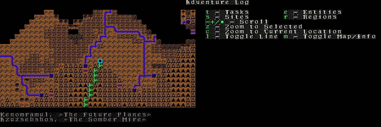 A warehouse full of items and color. 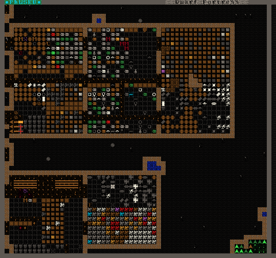 The Fortress Mode status screen, in all its be-fonted glory.  The great outdoors, showing the look of terrain a z-level down.  The great outdoors, with all the shrubs made unique. 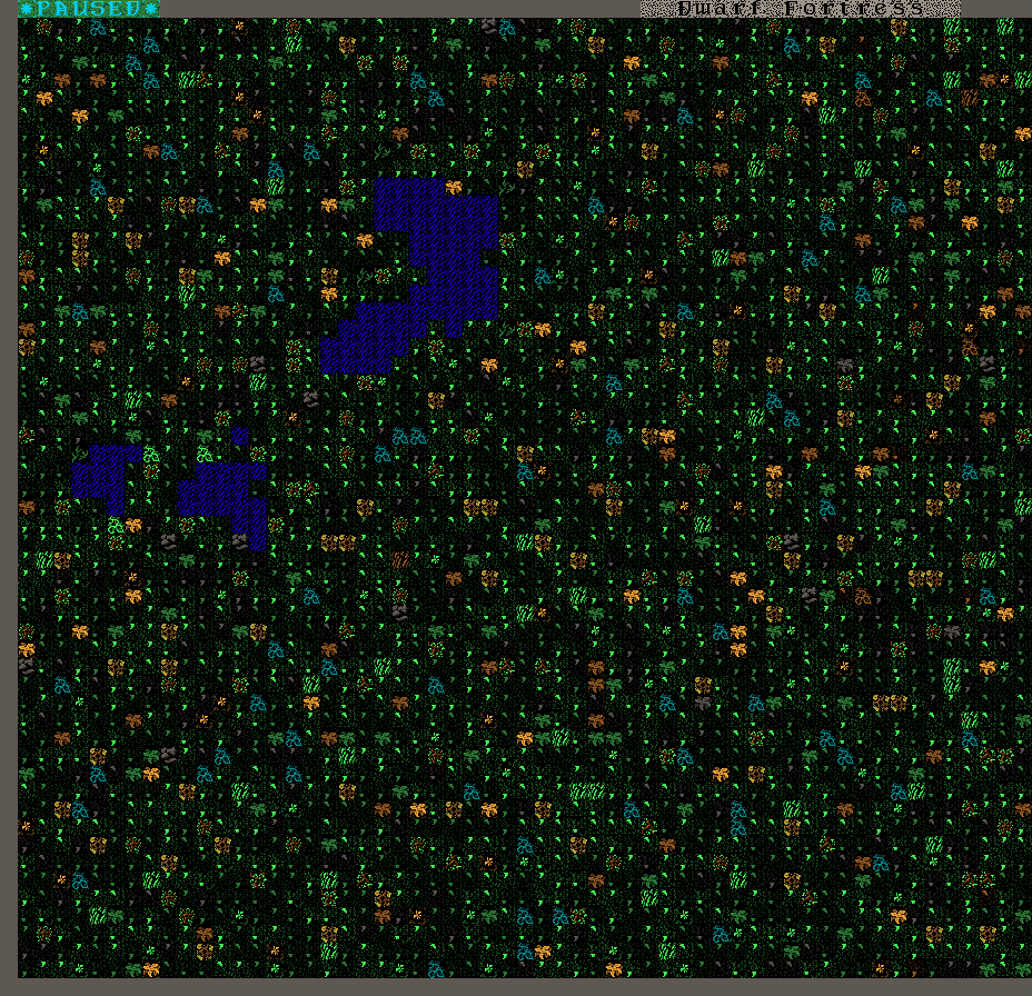 The Countess's palace, complete with patina copper doors. 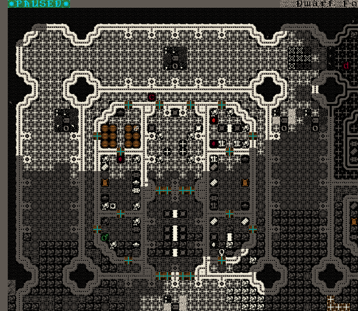 The ballista now with fanciness. 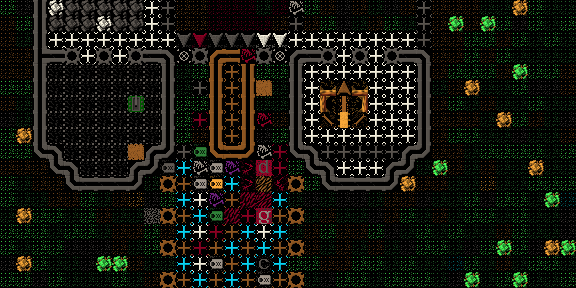 Installation is straight forward: drop init.txt into the data/init folder, drop the images into the data/art folder, and drop the contents of the object folder into raw/object. Backup your standard stuff, people! DawrfletterLite has less grit in the background than Gothic. Check the init file for resolution! It is a copy of mine, which is set for a 1400x900 display! This is still in beta right now; if you download, be sure to give me feedback at the thread in the DF forums: http://www.bay12games.com/forum/index.php?topic=38737.0 |
||||||||||||||||||||
| Checksum / Hash | ||||||||||||||||||||
| SHA-256: eada9a8df06ebeb306ef0f715b888a5289b320b62bb2895ef756a36188b1db86 | ||||||||||||||||||||
IP: logged Commands |
||||||||||||||||||||
| More From This Author | ||||||||||||||||||||